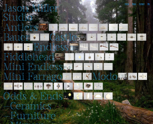
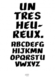
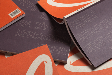
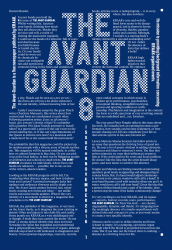
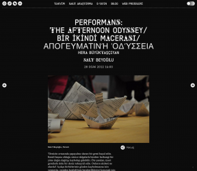
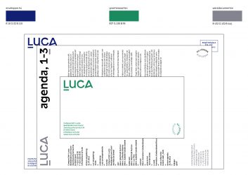
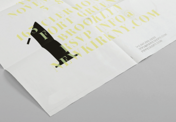
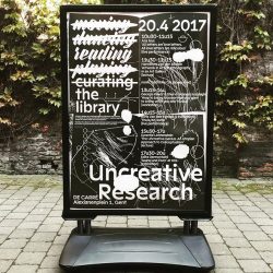
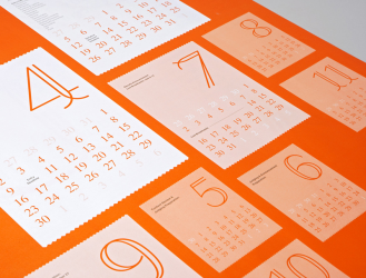
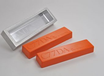
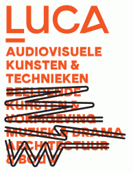
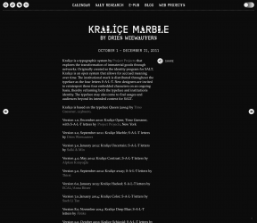
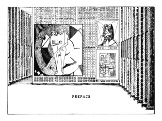
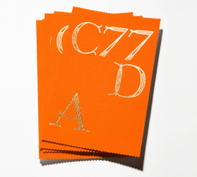
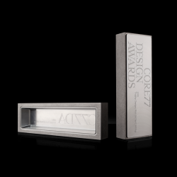
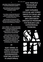
Temerity (béta)
Temerity is inspired by Plantin, with the intention to change
it’s appearance in bigger typesizes. Choices where made to remold
Plantin’s mechanical appearance, but making it seem less fragile. The
serifs became cupped to add character in larger point-sizes, while maintaining optimum
legibility
for continous text. For the same reason the edges of the serifs were bevelled, which
makes them appear rounded in small point sizes, whilst adding character in display
settings.
Unlike the common practice to increase contrast in display types, Temerity
has a reduced contrast to make it appear more contemporary. The higher contrast of
Plantin adds to the mechanical quality, but also to it’s specific zeitgeist.
To keep this feeling with the reduced contrast, the entire typeface was drawn on a 5 x 5
UPM grid. This reduces the serious nature of a serif text type, whilst emphasizing the
underlying grid.
Currently the character set is being expanded and the Light, Bold, Black with
matching Italics are being drawn. The italic tries to veer away from Plantin
Italic’s penlike qualities towards a simplified skeleton.
weights: Regular, Italic & Bold | date: 2009-2010 | format:
Opentype | state: unpublished béta